Visions Electronics Email Marketing
Marketing & Designs

Overview
Roles: Email Design | Copywriting and Content Writing
Duration: September 2023 - November 2023
Team: Deborah, King, & Christina
During the development phase of our new website, a decision was made to revamp our email templates as well. The existing templates had a distinctly outdated aesthetic, reminiscent of the early 2000s, and suffered from overcrowded content. Additionally, there was a lack of specificity in addressing various scenarios, such as distinguishing between online orders for in-store pickup and those shipped to a specific location.
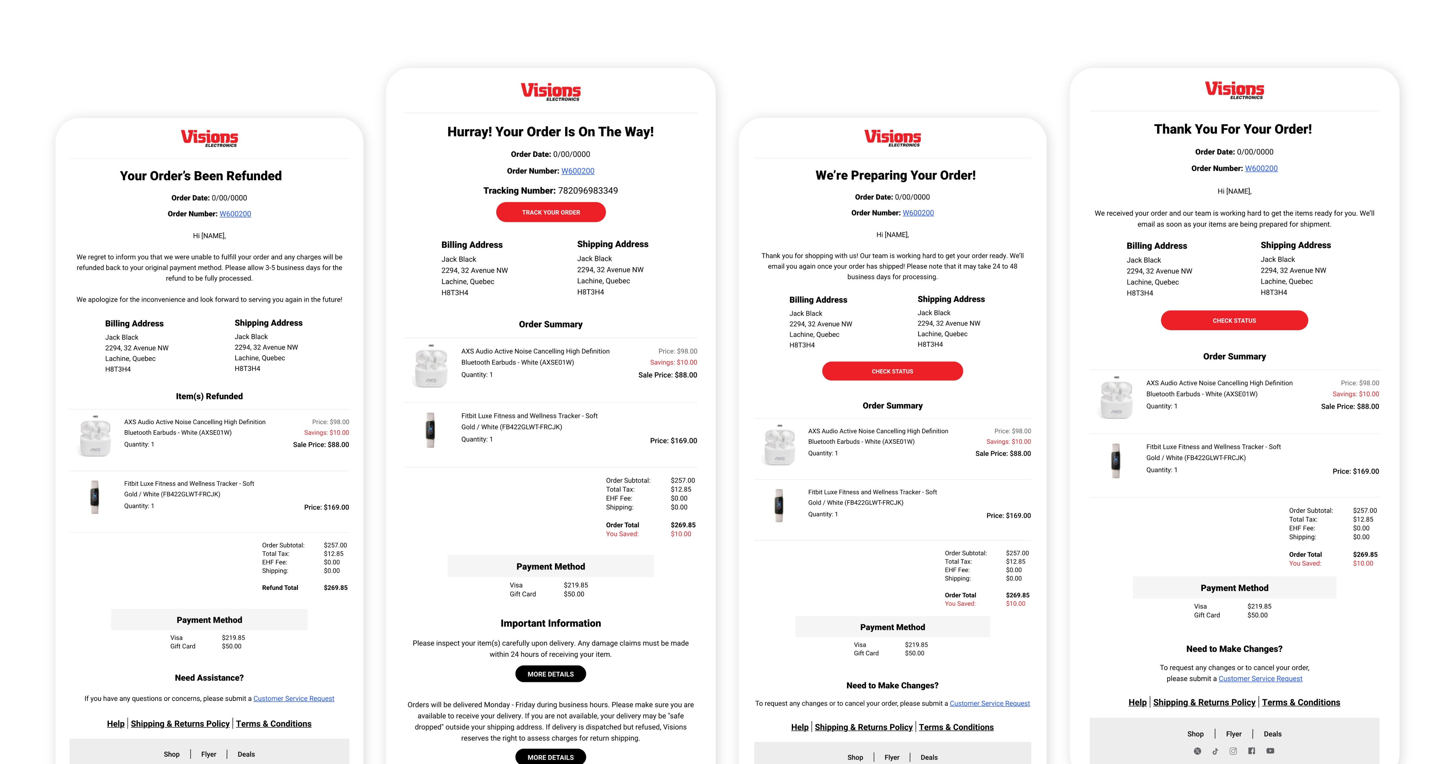
Recognizing the need for a more contemporary and tailored approach to email communication, my manager gave me the task to curate a suite of templates. These new designs seamlessly blend visual appeal with professionalism, aligning with our brand identity and contributing significantly to an enhanced communication strategy for Visions. This effort not only addressed the shortcomings of the previous templates but also ensured that our emails were both visually engaging and tailored to specific scenarios, ultimately elevating our overall communication standards.
Project Details
The Goal
Our goal was to modernize templates for specific scenarios, incorporating spacious designs with product images. We focused on improving user experience by adding informative content, links for customer support, and ensuring stakeholder approval through streamlined designs. The result was a more engaging and user-friendly communication tool.
Competitive Analysis
Research
My primary task involved researching and evaluating the strategies employed by other brands in their email marketing campaigns.
• Sample Collection: Gathered competitor emails, covering promotions, newsletters, and announcements.
• Layout and Structure: Assessed how content was organized, images and text placement, and patterns in call-to-action use.
• Content Strategy: Analyzed competitor email content for tone, topics, and engagement methods.
• Responsive Design Check: Verified cross-device adaptability, highlighting the importance of mobile-friendly content.
Next Steps
After crafting initial mockups, I collaborated with my team for thorough review and refinement. Once approved internally, we presented the designs to the head of Visions. His input led to specific word changes, like replacing "hooray!" with "Hurray!".
With the finalized design and content, I proceeded to create the ultimate visual mockups for the 12 email templates, including a mobile version. Subsequently, we seamlessly transitioned the approved designs to the development team, ensuring the integration of these new templates into the revamped website.
Email Design - Before & After
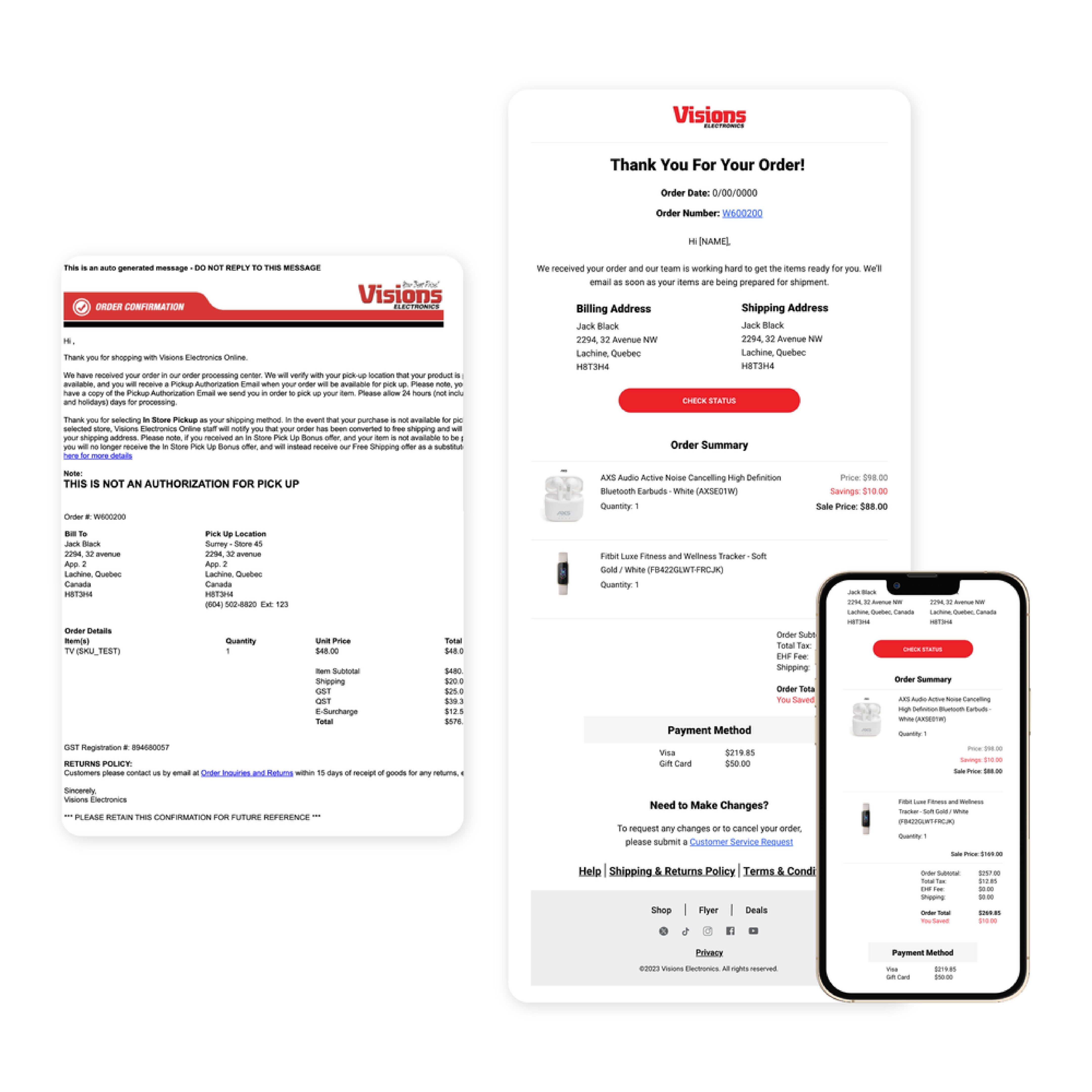
Order Confirmation (Image 1)
The original format (left) to the enhanced version (right), optimized for both web and mobile platforms.
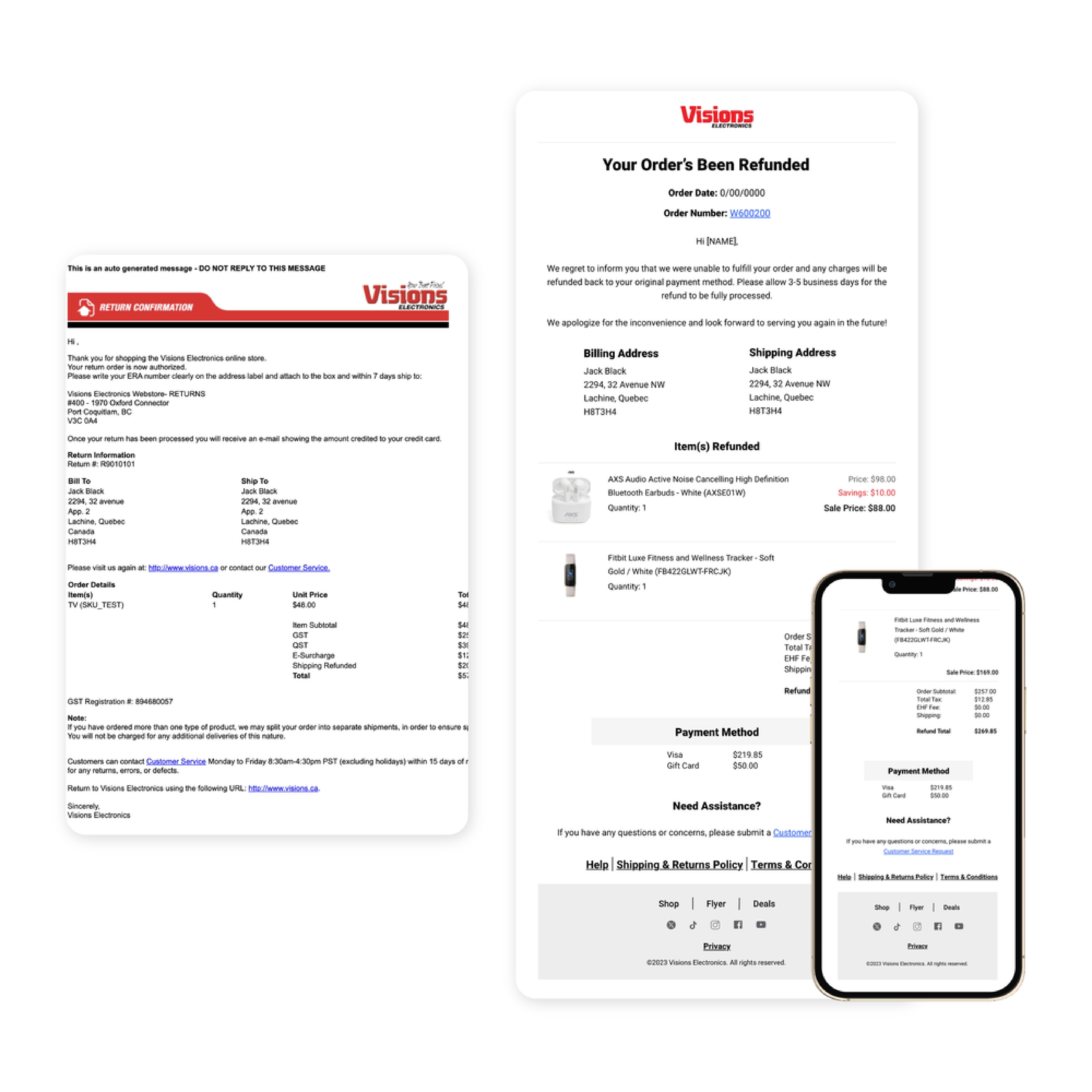
Order Refund Confirmation (Image 2)
The original format (left) to the enhanced version (right), optimized for both web and mobile platforms.
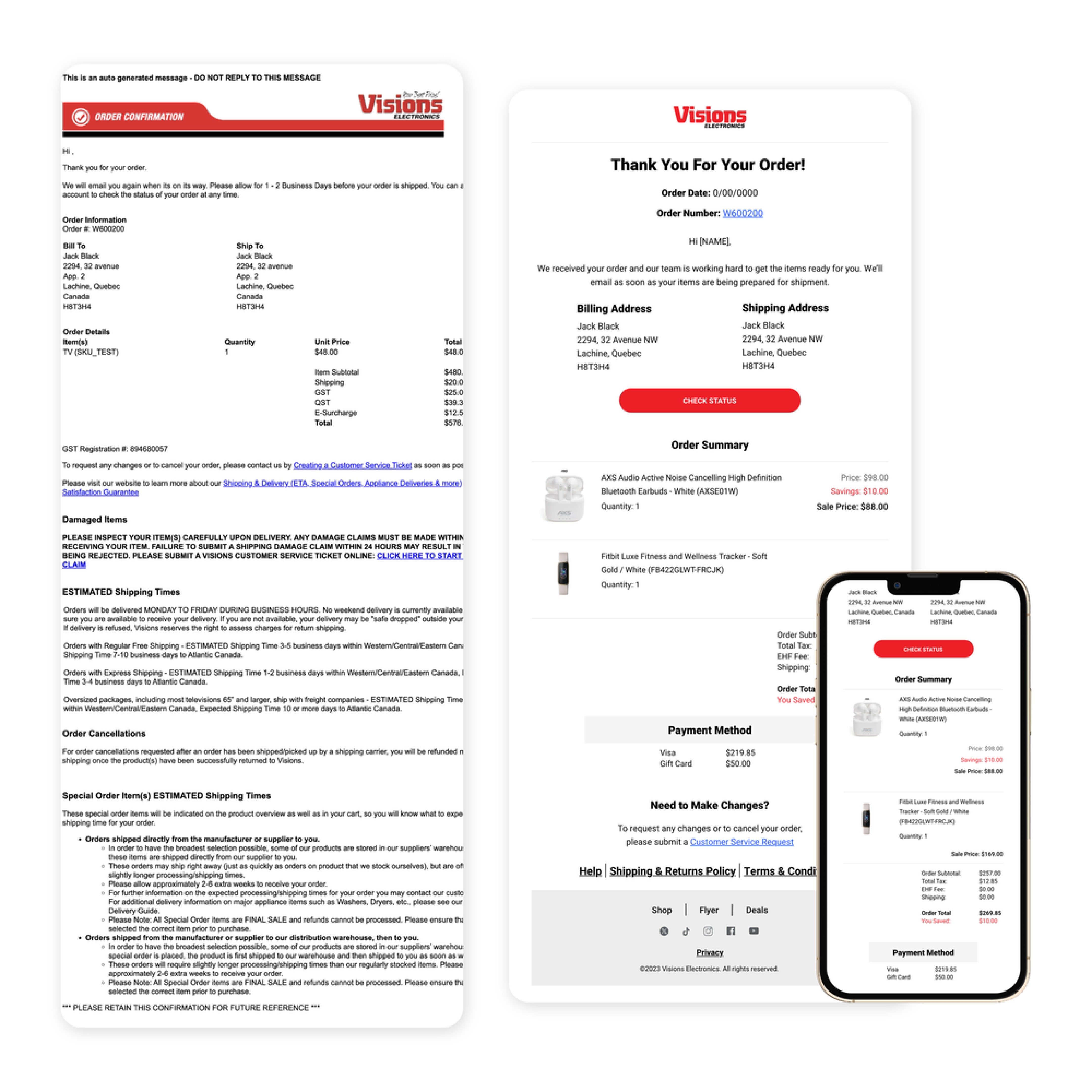
Thank you - Order has been picked up (Image 3)
The original format (left) to the enhanced version (right), optimized for both web and mobile platforms.
Takeaways
The email template task proved a valuable learning experience. Utilizing tools like Figma and Miro streamlined our collaborative design process, while competitive analysis inspired innovative choices. Prioritizing user-centric approaches, we adapted designs to diverse scenarios, emphasizing the dynamic nature of email communication.
This comprehensive approach, integrating design tools, market insights, and user needs, underscores the importance of a balance between visual appeal and functionality in crafting impactful email templates.
Visions Electronics Email Marketing
Marketing & Designs

Overview
Roles: Email Design | Copywriting and Content Writing
Duration: September 2023 - November 2023
Team: Deborah, King, & Christina
During the development phase of our new website, a decision was made to revamp our email templates as well. The existing templates had a distinctly outdated aesthetic, reminiscent of the early 2000s, and suffered from overcrowded content. Additionally, there was a lack of specificity in addressing various scenarios, such as distinguishing between online orders for in-store pickup and those shipped to a specific location.
Recognizing the need for a more contemporary and tailored approach to email communication, my manager gave me the task to curate a suite of templates. These new designs seamlessly blend visual appeal with professionalism, aligning with our brand identity and contributing significantly to an enhanced communication strategy for Visions. This effort not only addressed the shortcomings of the previous templates but also ensured that our emails were both visually engaging and tailored to specific scenarios, ultimately elevating our overall communication standards.

Project Details
The Goal
Our goal was to modernize templates for specific scenarios, incorporating spacious designs with product images. We focused on improving user experience by adding informative content, links for customer support, and ensuring stakeholder approval through streamlined designs. The result was a more engaging and user-friendly communication tool.
Competitive Analysis
Research
My primary task involved researching and evaluating the strategies employed by other brands in their email marketing campaigns.
• Sample Collection: Gathered competitor emails, covering promotions, newsletters, and announcements.
• Layout and Structure: Assessed how content was organized, images and text placement, and patterns in call-to-action use.
• Content Strategy: Analyzed competitor email content for tone, topics, and engagement methods.
• Responsive Design Check: Verified cross-device adaptability, highlighting the importance of mobile-friendly content.
Next Steps
After crafting initial mockups, I collaborated with my team for thorough review and refinement. Once approved internally, we presented the designs to the head of Visions. His input led to specific word changes, like replacing "hooray!" with "Hurray!".
With the finalized design and content, I proceeded to create the ultimate visual mockups for the 12 email templates, including a mobile version. Subsequently, we seamlessly transitioned the approved designs to the development team, ensuring the integration of these new templates into the revamped website.
Email Design - Before & After
Order Confirmation (Image 1)
The original format (left) to the enhanced version (right), optimized for both web and mobile platforms.

Order Refund Confirmation (Image 2)
The original format (left) to the enhanced version (right), optimized for both web and mobile platforms.

Thank you - Order has been picked up (Image 3)
The original format (left) to the enhanced version (right), optimized for both web and mobile platforms.

Takeaways
The email template task proved a valuable learning experience. Utilizing tools like Figma and Miro streamlined our collaborative design process, while competitive analysis inspired innovative choices. Prioritizing user-centric approaches, we adapted designs to diverse scenarios, emphasizing the dynamic nature of email communication.
This comprehensive approach, integrating design tools, market insights, and user needs, underscores the importance of a balance between visual appeal and functionality in crafting impactful email templates.
Visions Electronics Email Marketing
Marketing & Designs

Overview
Roles: Email Design | Copywriting and Content Writing
Duration: September 2023 - November 2023
Team: Deborah, King, & Christina
During the development phase of our new website, a decision was made to revamp our email templates as well. The existing templates had a distinctly outdated aesthetic, reminiscent of the early 2000s, and suffered from overcrowded content. Additionally, there was a lack of specificity in addressing various scenarios, such as distinguishing between online orders for in-store pickup and those shipped to a specific location.
Recognizing the need for a more contemporary and tailored approach to email communication, my manager gave me the task to curate a suite of templates. These new designs seamlessly blend visual appeal with professionalism, aligning with our brand identity and contributing significantly to an enhanced communication strategy for Visions. This effort not only addressed the shortcomings of the previous templates but also ensured that our emails were both visually engaging and tailored to specific scenarios, ultimately elevating our overall communication standards.

Project Details
The Goal
Our goal was to modernize templates for specific scenarios, incorporating spacious designs with product images. We focused on improving user experience by adding informative content, links for customer support, and ensuring stakeholder approval through streamlined designs. The result was a more engaging and user-friendly communication tool.
Competitive Analysis
Research
My primary task involved researching and evaluating the strategies employed by other brands in their email marketing campaigns.
• Sample Collection: Gathered competitor emails, covering promotions, newsletters, and announcements.
• Layout and Structure: Assessed how content was organized, images and text placement, and patterns in call-to-action use.
• Content Strategy: Analyzed competitor email content for tone, topics, and engagement methods.
• Responsive Design Check: Verified cross-device adaptability, highlighting the importance of mobile-friendly content.
Next Steps
After crafting initial mockups, I collaborated with my team for thorough review and refinement. Once approved internally, we presented the designs to the head of Visions. His input led to specific word changes, like replacing "hooray!" with "Hurray!".
With the finalized design and content, I proceeded to create the ultimate visual mockups for the 12 email templates, including a mobile version. Subsequently, we seamlessly transitioned the approved designs to the development team, ensuring the integration of these new templates into the revamped website.
Email Design - Before & After
Order Confirmation (Image 1)
The original format (left) to the enhanced version (right), optimized for both web and mobile platforms.

Order Refund Confirmation (Image 2)
The original format (left) to the enhanced version (right), optimized for both web and mobile platforms.

Thank you - Order has been picked up (Image 3)
The original format (left) to the enhanced version (right), optimized for both web and mobile platforms.

Takeaways
The email template task proved a valuable learning experience. Utilizing tools like Figma and Miro streamlined our collaborative design process, while competitive analysis inspired innovative choices. Prioritizing user-centric approaches, we adapted designs to diverse scenarios, emphasizing the dynamic nature of email communication.
This comprehensive approach, integrating design tools, market insights, and user needs, underscores the importance of a balance between visual appeal and functionality in crafting impactful email templates.
Visions Electronics Email Marketing
Marketing & Designs

Overview
Roles: Email Design | Copywriting and Content Writing
Duration: September 2023 - November 2023
Team: Deborah, King, & Christina
During the development phase of our new website, a decision was made to revamp our email templates as well. The existing templates had a distinctly outdated aesthetic, reminiscent of the early 2000s, and suffered from overcrowded content. Additionally, there was a lack of specificity in addressing various scenarios, such as distinguishing between online orders for in-store pickup and those shipped to a specific location.
Recognizing the need for a more contemporary and tailored approach to email communication, my manager gave me the task to curate a suite of templates. These new designs seamlessly blend visual appeal with professionalism, aligning with our brand identity and contributing significantly to an enhanced communication strategy for Visions. This effort not only addressed the shortcomings of the previous templates but also ensured that our emails were both visually engaging and tailored to specific scenarios, ultimately elevating our overall communication standards.

Project Details
The Goal
Our goal was to modernize templates for specific scenarios, incorporating spacious designs with product images. We focused on improving user experience by adding informative content, links for customer support, and ensuring stakeholder approval through streamlined designs. The result was a more engaging and user-friendly communication tool.
Competitive Analysis
Research
My primary task involved researching and evaluating the strategies employed by other brands in their email marketing campaigns.
• Sample Collection: Gathered competitor emails, covering promotions, newsletters, and announcements.
• Layout and Structure: Assessed how content was organized, images and text placement, and patterns in call-to-action use.
• Content Strategy: Analyzed competitor email content for tone, topics, and engagement methods.
• Responsive Design Check: Verified cross-device adaptability, highlighting the importance of mobile-friendly content.
Next Steps
After crafting initial mockups, I collaborated with my team for thorough review and refinement. Once approved internally, we presented the designs to the head of Visions. His input led to specific word changes, like replacing "hooray!" with "Hurray!".
With the finalized design and content, I proceeded to create the ultimate visual mockups for the 12 email templates, including a mobile version. Subsequently, we seamlessly transitioned the approved designs to the development team, ensuring the integration of these new templates into the revamped website.
Email Design - Before & After
Order Confirmation (Image 1)
The original format (left) to the enhanced version (right), optimized for both web and mobile platforms.

Order Refund Confirmation (Image 2)
The original format (left) to the enhanced version (right), optimized for both web and mobile platforms.

Thank you - Order has been picked up (Image 3)
The original format (left) to the enhanced version (right), optimized for both web and mobile platforms.

Takeaways
The email template task proved a valuable learning experience. Utilizing tools like Figma and Miro streamlined our collaborative design process, while competitive analysis inspired innovative choices. Prioritizing user-centric approaches, we adapted designs to diverse scenarios, emphasizing the dynamic nature of email communication.
This comprehensive approach, integrating design tools, market insights, and user needs, underscores the importance of a balance between visual appeal and functionality in crafting impactful email templates.
