Visions Electronics
UX/UI Research & Design

About
Roles: UX/UI Designer
Duration: September 2023 - December 2023
Tools: Figma, Adobe XD
Visions Electronics is one of the leading players in the ever-evolving landscape of electronic retail in Canada, having grown into a prominent electronics retailer with 43 superstores and a dedicated workforce of over 1,000 employees.
My focus was on the comprehensive redesign of the website, ensuring a seamless user experience within the online marketplace. Additionally, I led the design for the "Kudo’s Points" website, a platform where employees could redeem points for gift cards from various brands such as Starbucks and Lululemon.
Project Details
Design Goal
The main goal was to design a simple, modern website with easy product discovery and search functionalities. It was important to have a smooth, quick checkout process to enhance user satisfaction, aiming for an overall exceptional user experience.
Design Criteria
• Usability: Prioritized an intuitive design for easy navigation without confusion or frustration.
• Clarity and Simplicity: Emphasized a clean, straightforward design to clearly convey information and functionality.
• Efficiency: Streamlined user workflows to minimize time and effort needed for tasks.
• Feedback and Responsiveness: Provided clear feedback for user actions to enhance awareness of the system's response.
• Error Prevention and Handling: Prevented user errors through thoughtful design, accompanied by helpful error messages when necessary.
The Current Website
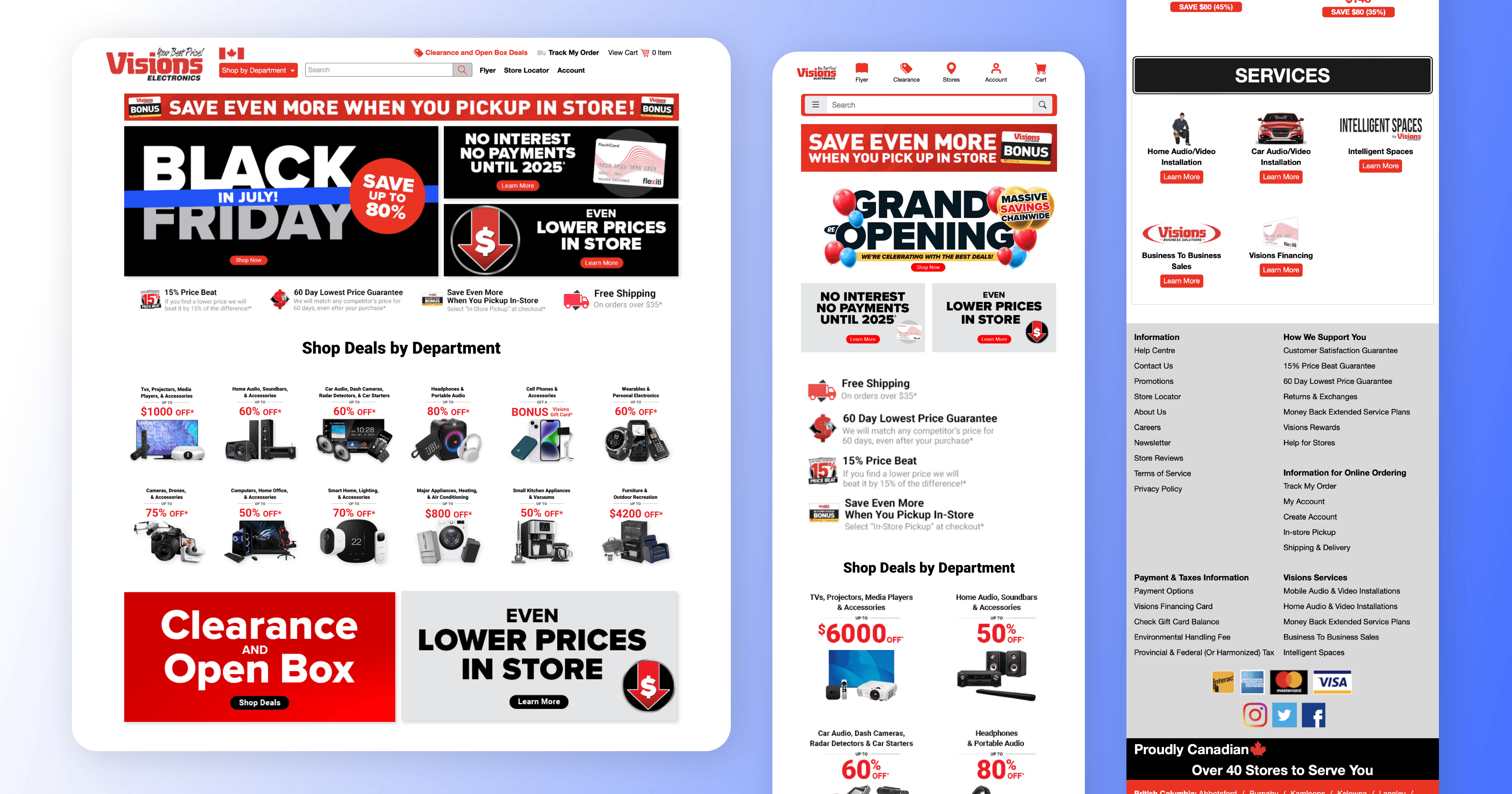
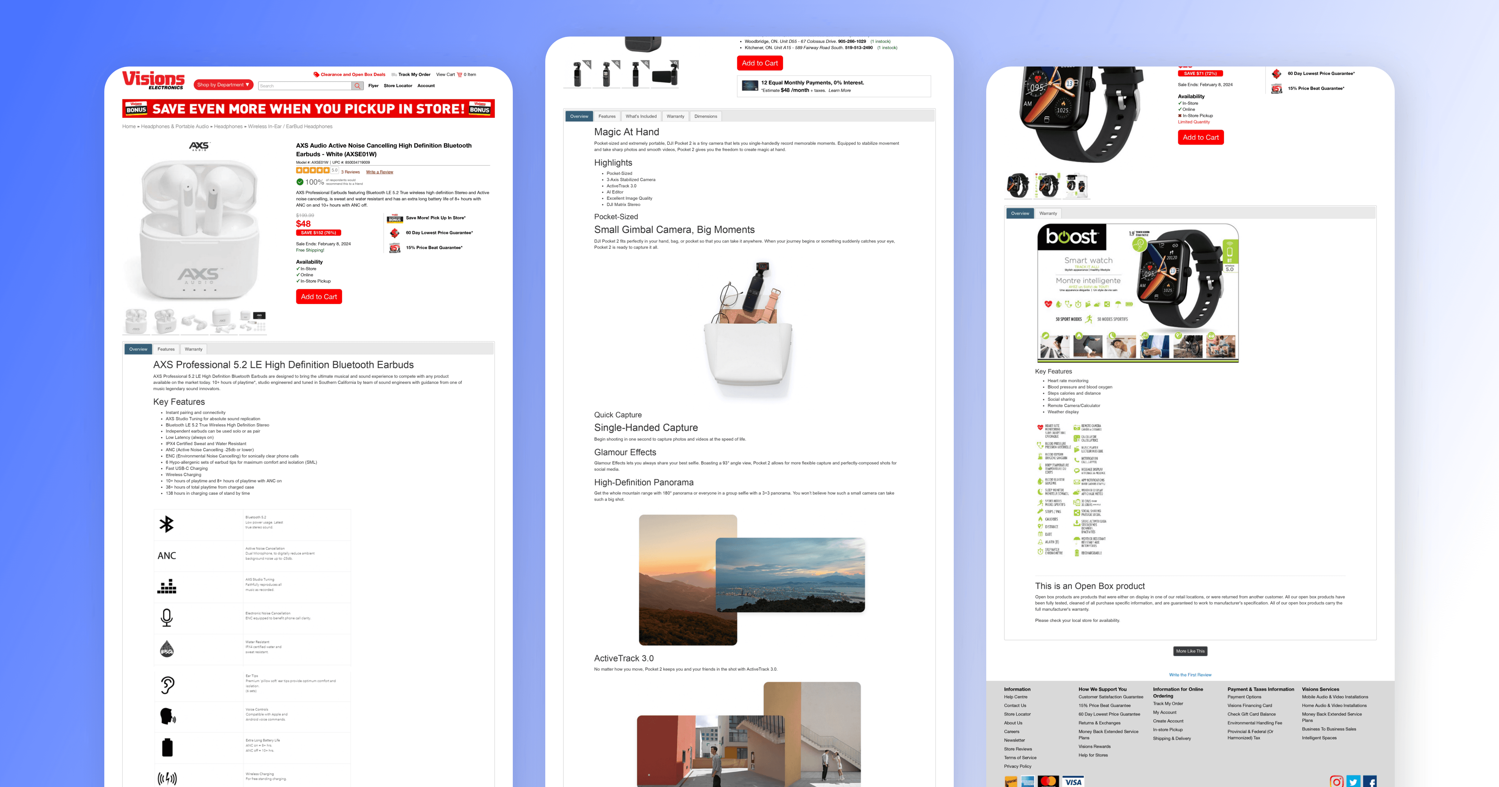
The existing website for Visions Electronics presented a design reminiscent of a dated 2000s flyer, lacking the modern aesthetic and sophistication expected in today's digital landscape. The checkout process was notably lengthy, comprising five steps that potentially led to user frustration and drop-offs. Additionally, the product description page appeared unprofessional, lacking the visual finesse required for an engaging and trustworthy online shopping experience.
Furthermore, the current design suffered from inconsistencies in brand representation and visual hierarchy, potentially causing confusion for users navigating through the platform. As a result, addressing these shortcomings became imperative to align the online presence of Visions Electronics with contemporary design standards and to elevate the overall user experience.
UX Redesign Insights:
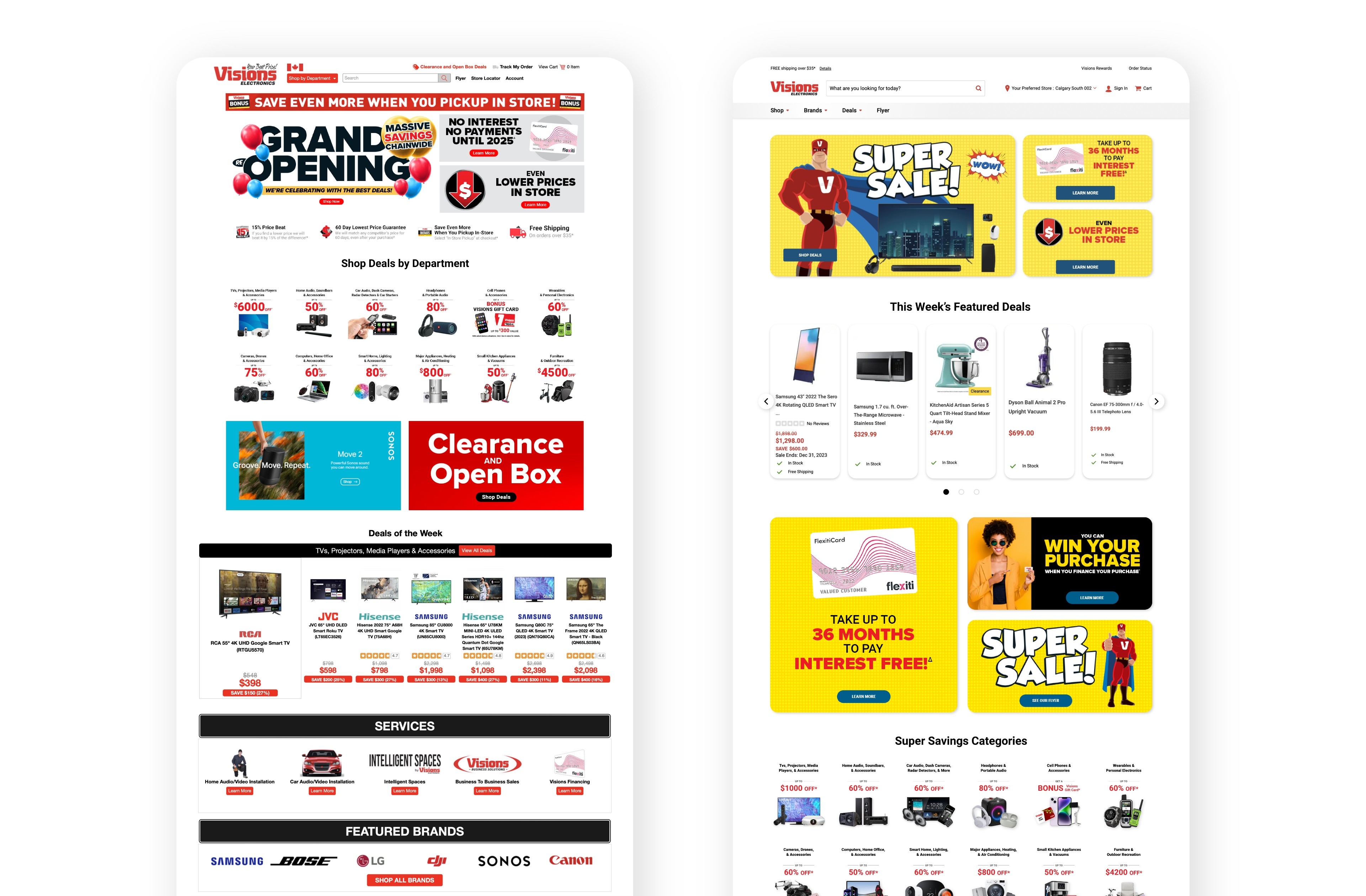
Overcoming certain design limitations posed by stakeholder preferences, I integrated familiar elements, retaining some old graphic designs as per stakeholder request. Despite the desire to maintain a touch of familiarity, efforts were made to modernize key aspects.
To enhance product visibility and organization, I revamped the product cards, introducing increased spacing for a more organized presentation. The callout category images underwent a modern transformation, incorporating subtle shadow effects and updated visuals to showcase new products.
Business Strategy Integration:
Analyzing user behaviour through heat maps revealed minimal scrolling tendencies. In response, the new website layout strategically positioned the "This Week's Featured Deals" product carousel immediately below the banner. This intentional shift aimed to expedite user engagement, allowing them to swiftly explore and proceed to checkout without extensive scrolling. This adaptation aligned with our goal of optimizing user experience based on observed user patterns.
Current Website (Left Side) & New Website (Right Side)
Usability Studies & A/B Testing
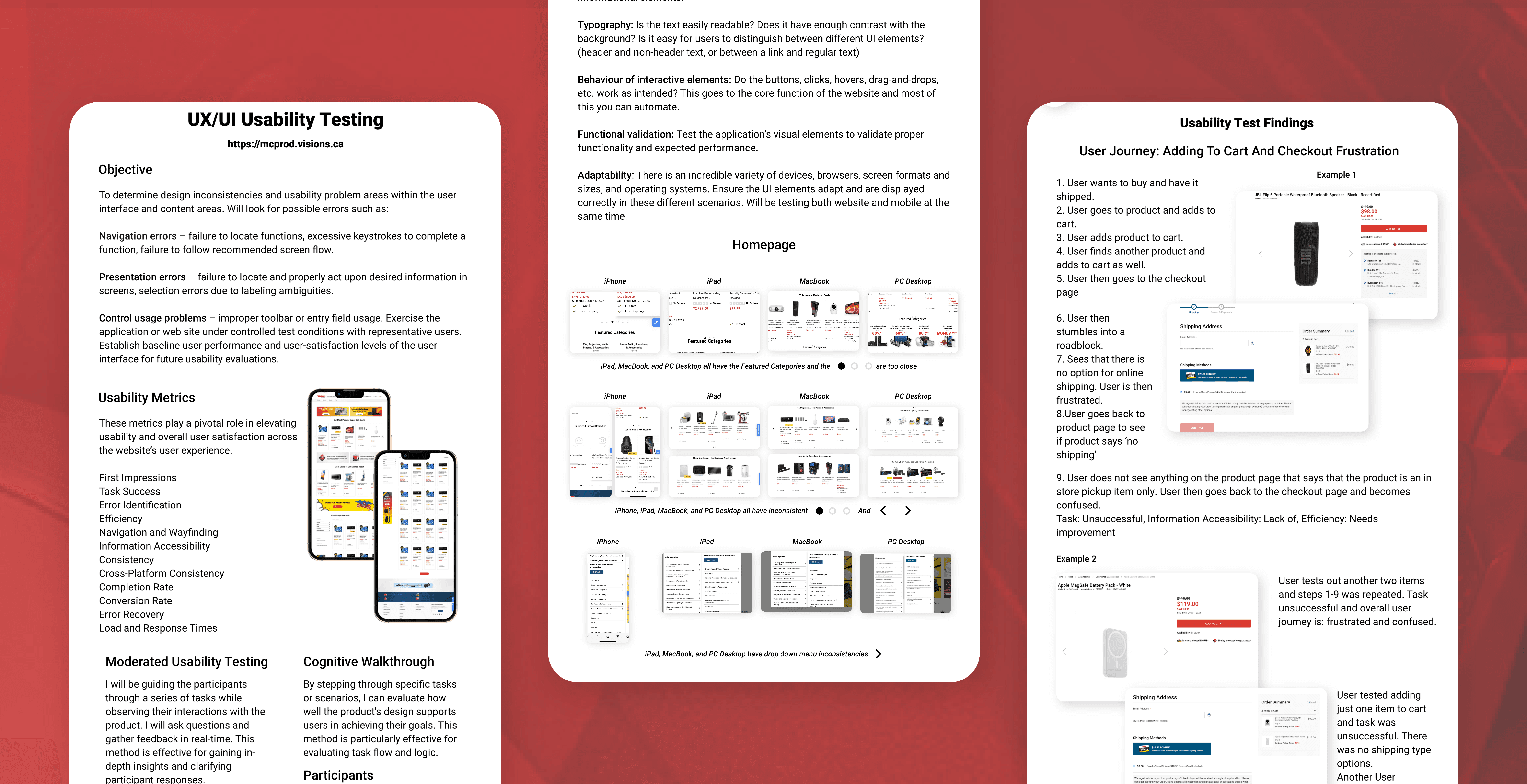
My primary goal was to identify design inconsistencies and usability challenges through Moderated Usability Testing and Cognitive Walkthrough methods. Tasks included assessing mobile accessibility, identifying slow loading times, and navigating refund processes, aiming to uncover potential issues in navigation, presentation, and control usage.
Usability test findings revealed challenges in the checkout process, information accessibility, and performance issues. Users faced frustration with the absence of online shipping options during checkout, leading to a significant task failure rate. Despite positive first impressions, concerns about slow loading times impacted satisfaction and conversion decisions.
Moving forward, addressing checkout, improving information accessibility, and optimizing performance are crucial for enhancing task success rates and user satisfaction. The UI Testing Checklist - Manual Testing ensured consistency across platforms, covering elements like color, spelling, typography, interaction behavior, and adaptability. This dual approach provides a robust framework for refining the website to align more closely with user expectations and industry standards.
Findings
• To enhance satisfaction and conversions, addressing these concerns and leveraging user insights is crucial.
• The dual usability and UI testing approach offer a comprehensive strategy for refining the site to align with user expectations.
• The key takeaway stresses the urgent need for targeted improvements to enhance overall effectiveness.
Visual Design
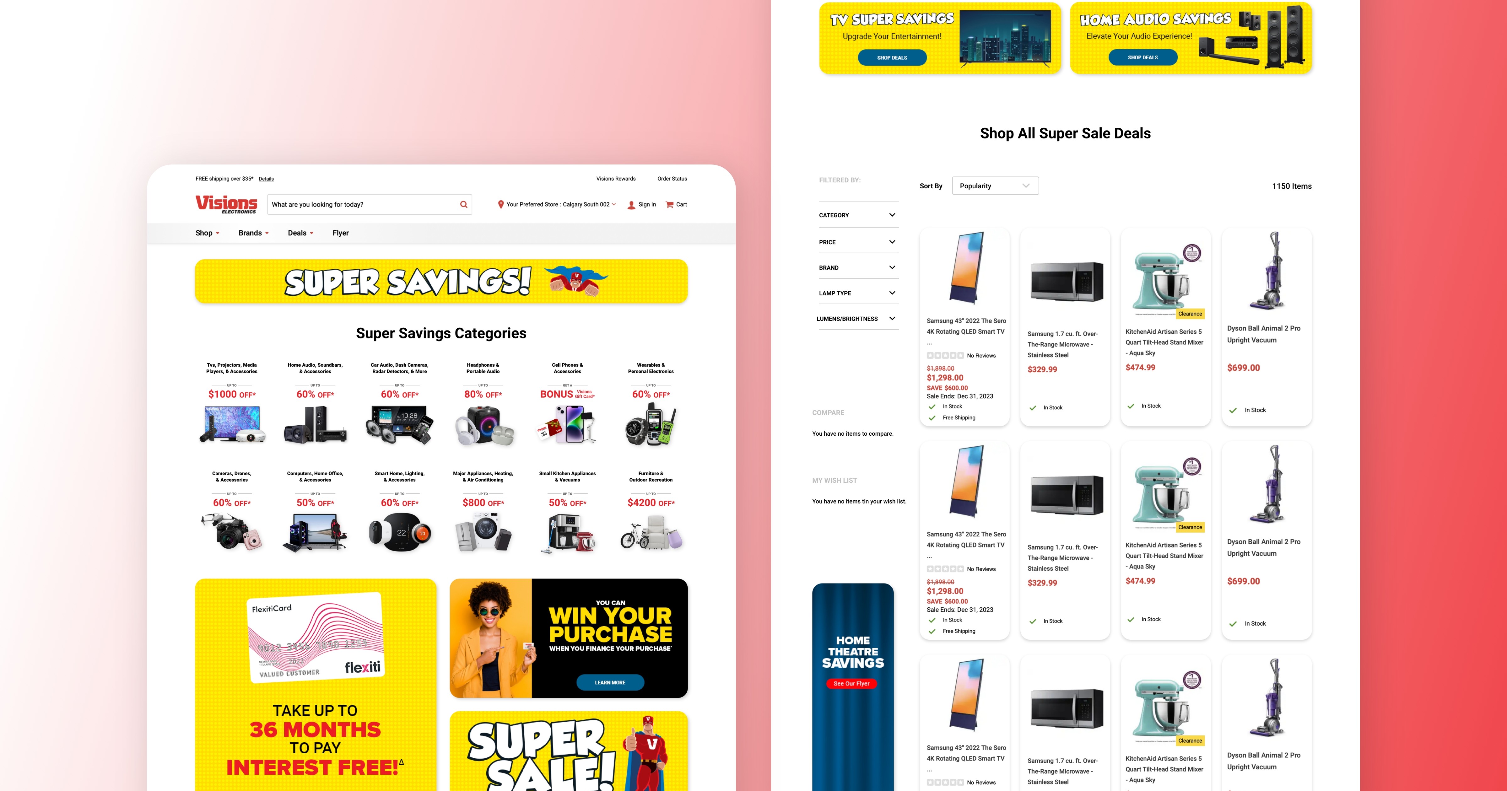
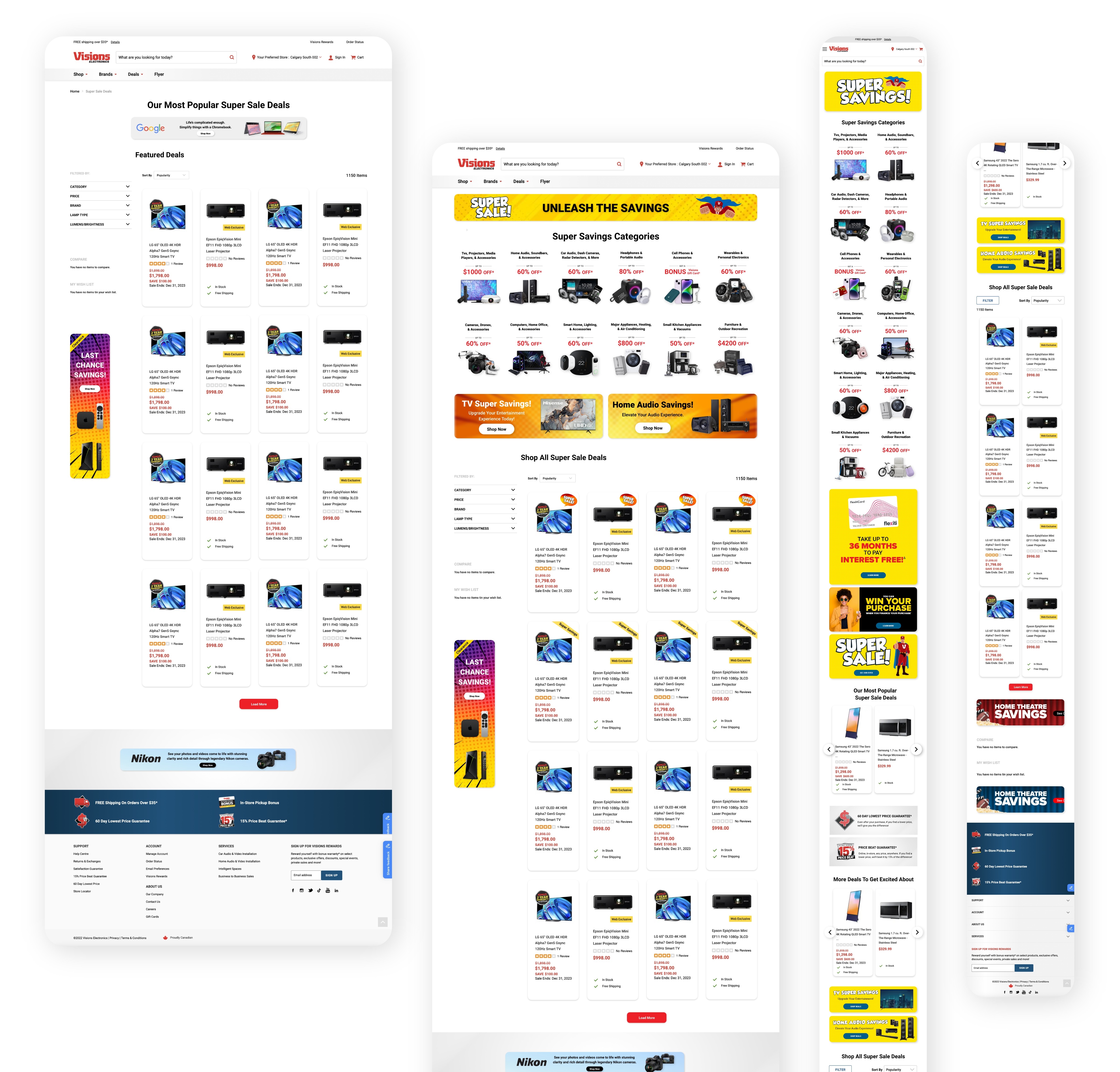
These are some of the new design pages for the Super Sales week, showcasing featured products on sale. The result is a visually compelling platform that effectively captures user attention and encourages exploration of enticing deals.
Takeaways
I thoroughly enjoyed this project and gained valuable insights along the way. From tackling usability challenges to fine-tuning the checkout process and optimizing performance through A/B testing, the journey was both challenging and rewarding. The strategic use of a dual testing approach, covering both usability and UI aspects, proved robust in elevating the overall design. This experience served as a personal lesson in the iterative nature of UX/UI design, emphasizing the importance of aligning stakeholder expectations with contemporary user-centric principles.
Visions Electronics
UX/UI Research & Design

About
Roles: UX/UI Designer
Duration: September 2023 - December 2023
Tools: Figma, Adobe XD
Visions Electronics is one of the leading players in the ever-evolving landscape of electronic retail in Canada, having grown into a prominent electronics retailer with 43 superstores and a dedicated workforce of over 1,000 employees.
My focus was on the comprehensive redesign of the website, ensuring a seamless user experience within the online marketplace. Additionally, I led the design for the "Kudo’s Points" website, a platform where employees could redeem points for gift cards from various brands such as Starbucks and Lululemon.

Project Details
Design Goal
The main goal was to design a simple, modern website with easy product discovery and search functionalities. It was important to have a smooth, quick checkout process to enhance user satisfaction, aiming for an overall exceptional user experience.
Design Criteria
• Usability: Prioritized an intuitive design for easy navigation without confusion or frustration.
• Clarity and Simplicity: Emphasized a clean, straightforward design to clearly convey information and functionality.
• Efficiency: Streamlined user workflows to minimize time and effort needed for tasks.
• Feedback and Responsiveness: Provided clear feedback for user actions to enhance awareness of the system's response.
• Error Prevention and Handling: Prevented user errors through thoughtful design, accompanied by helpful error messages when necessary.
The Current Website
The existing website for Visions Electronics presented a design reminiscent of a dated 2000s flyer, lacking the modern aesthetic and sophistication expected in today's digital landscape. The checkout process was notably lengthy, comprising five steps that potentially led to user frustration and drop-offs. Additionally, the product description page appeared unprofessional, lacking the visual finesse required for an engaging and trustworthy online shopping experience.
Furthermore, the current design suffered from inconsistencies in brand representation and visual hierarchy, potentially causing confusion for users navigating through the platform. As a result, addressing these shortcomings became imperative to align the online presence of Visions Electronics with contemporary design standards and to elevate the overall user experience.


UX Redesign Insights:
Overcoming certain design limitations posed by stakeholder preferences, I integrated familiar elements, retaining some old graphic designs as per stakeholder request. Despite the desire to maintain a touch of familiarity, efforts were made to modernize key aspects.
To enhance product visibility and organization, I revamped the product cards, introducing increased spacing for a more organized presentation. The callout category images underwent a modern transformation, incorporating subtle shadow effects and updated visuals to showcase new products.
Business Strategy Integration:
Analyzing user behaviour through heat maps revealed minimal scrolling tendencies. In response, the new website layout strategically positioned the "This Week's Featured Deals" product carousel immediately below the banner. This intentional shift aimed to expedite user engagement, allowing them to swiftly explore and proceed to checkout without extensive scrolling. This adaptation aligned with our goal of optimizing user experience based on observed user patterns.
Current Website (Left Side) & New Website (Right Side)

Usability Studies & A/B Testing
My primary goal was to identify design inconsistencies and usability challenges through Moderated Usability Testing and Cognitive Walkthrough methods. Tasks included assessing mobile accessibility, identifying slow loading times, and navigating refund processes, aiming to uncover potential issues in navigation, presentation, and control usage.
Usability test findings revealed challenges in the checkout process, information accessibility, and performance issues. Users faced frustration with the absence of online shipping options during checkout, leading to a significant task failure rate. Despite positive first impressions, concerns about slow loading times impacted satisfaction and conversion decisions.
Moving forward, addressing checkout, improving information accessibility, and optimizing performance are crucial for enhancing task success rates and user satisfaction. The UI Testing Checklist - Manual Testing ensured consistency across platforms, covering elements like color, spelling, typography, interaction behavior, and adaptability. This dual approach provides a robust framework for refining the website to align more closely with user expectations and industry standards.

Findings
• To enhance satisfaction and conversions, addressing these concerns and leveraging user insights is crucial.
• The dual usability and UI testing approach offer a comprehensive strategy for refining the site to align with user expectations.
• The key takeaway stresses the urgent need for targeted improvements to enhance overall effectiveness.
Visual Design
These are some of the new design pages for the Super Sales week, showcasing featured products on sale. The result is a visually compelling platform that effectively captures user attention and encourages exploration of enticing deals.

Takeaways
I thoroughly enjoyed this project and gained valuable insights along the way. From tackling usability challenges to fine-tuning the checkout process and optimizing performance through A/B testing, the journey was both challenging and rewarding. The strategic use of a dual testing approach, covering both usability and UI aspects, proved robust in elevating the overall design. This experience served as a personal lesson in the iterative nature of UX/UI design, emphasizing the importance of aligning stakeholder expectations with contemporary user-centric principles.
Visions Electronics
UX/UI Research & Design

About
Roles: UX/UI Designer
Duration: September 2023 - December 2023
Tools: Figma, Adobe XD
Visions Electronics is one of the leading players in the ever-evolving landscape of electronic retail in Canada, having grown into a prominent electronics retailer with 43 superstores and a dedicated workforce of over 1,000 employees.
My focus was on the comprehensive redesign of the website, ensuring a seamless user experience within the online marketplace. Additionally, I led the design for the "Kudo’s Points" website, a platform where employees could redeem points for gift cards from various brands such as Starbucks and Lululemon.

Project Details
Design Goal
The main goal was to design a simple, modern website with easy product discovery and search functionalities. It was important to have a smooth, quick checkout process to enhance user satisfaction, aiming for an overall exceptional user experience.
Design Criteria
• Usability: Prioritized an intuitive design for easy navigation without confusion or frustration.
• Clarity and Simplicity: Emphasized a clean, straightforward design to clearly convey information and functionality.
• Efficiency: Streamlined user workflows to minimize time and effort needed for tasks.
• Feedback and Responsiveness: Provided clear feedback for user actions to enhance awareness of the system's response.
• Error Prevention and Handling: Prevented user errors through thoughtful design, accompanied by helpful error messages when necessary.
The Current Website
The existing website for Visions Electronics presented a design reminiscent of a dated 2000s flyer, lacking the modern aesthetic and sophistication expected in today's digital landscape. The checkout process was notably lengthy, comprising five steps that potentially led to user frustration and drop-offs. Additionally, the product description page appeared unprofessional, lacking the visual finesse required for an engaging and trustworthy online shopping experience.
Furthermore, the current design suffered from inconsistencies in brand representation and visual hierarchy, potentially causing confusion for users navigating through the platform. As a result, addressing these shortcomings became imperative to align the online presence of Visions Electronics with contemporary design standards and to elevate the overall user experience.


UX Redesign Insights:
Overcoming certain design limitations posed by stakeholder preferences, I integrated familiar elements, retaining some old graphic designs as per stakeholder request. Despite the desire to maintain a touch of familiarity, efforts were made to modernize key aspects.
To enhance product visibility and organization, I revamped the product cards, introducing increased spacing for a more organized presentation. The callout category images underwent a modern transformation, incorporating subtle shadow effects and updated visuals to showcase new products.
Business Strategy Integration:
Analyzing user behaviour through heat maps revealed minimal scrolling tendencies. In response, the new website layout strategically positioned the "This Week's Featured Deals" product carousel immediately below the banner. This intentional shift aimed to expedite user engagement, allowing them to swiftly explore and proceed to checkout without extensive scrolling. This adaptation aligned with our goal of optimizing user experience based on observed user patterns.
Current Website (Left Side) & New Website (Right Side)

Usability Studies & A/B Testing
My primary goal was to identify design inconsistencies and usability challenges through Moderated Usability Testing and Cognitive Walkthrough methods. Tasks included assessing mobile accessibility, identifying slow loading times, and navigating refund processes, aiming to uncover potential issues in navigation, presentation, and control usage.
Usability test findings revealed challenges in the checkout process, information accessibility, and performance issues. Users faced frustration with the absence of online shipping options during checkout, leading to a significant task failure rate. Despite positive first impressions, concerns about slow loading times impacted satisfaction and conversion decisions.
Moving forward, addressing checkout, improving information accessibility, and optimizing performance are crucial for enhancing task success rates and user satisfaction. The UI Testing Checklist - Manual Testing ensured consistency across platforms, covering elements like color, spelling, typography, interaction behavior, and adaptability. This dual approach provides a robust framework for refining the website to align more closely with user expectations and industry standards.

Findings
• To enhance satisfaction and conversions, addressing these concerns and leveraging user insights is crucial.
• The dual usability and UI testing approach offer a comprehensive strategy for refining the site to align with user expectations.
• The key takeaway stresses the urgent need for targeted improvements to enhance overall effectiveness.
Visual Design
These are some of the new design pages for the Super Sales week, showcasing featured products on sale. The result is a visually compelling platform that effectively captures user attention and encourages exploration of enticing deals.

Takeaways
I thoroughly enjoyed this project and gained valuable insights along the way. From tackling usability challenges to fine-tuning the checkout process and optimizing performance through A/B testing, the journey was both challenging and rewarding. The strategic use of a dual testing approach, covering both usability and UI aspects, proved robust in elevating the overall design. This experience served as a personal lesson in the iterative nature of UX/UI design, emphasizing the importance of aligning stakeholder expectations with contemporary user-centric principles.
Visions Electronics
UX/UI Research & Design

About
Roles: UX/UI Designer
Duration: September 2023 - December 2023
Tools: Figma, Adobe XD
Visions Electronics is one of the leading players in the ever-evolving landscape of electronic retail in Canada, having grown into a prominent electronics retailer with 43 superstores and a dedicated workforce of over 1,000 employees.
My focus was on the comprehensive redesign of the website, ensuring a seamless user experience within the online marketplace. Additionally, I led the design for the "Kudo’s Points" website, a platform where employees could redeem points for gift cards from various brands such as Starbucks and Lululemon.

Project Details
Design Goal
The main goal was to design a simple, modern website with easy product discovery and search functionalities. It was important to have a smooth, quick checkout process to enhance user satisfaction, aiming for an overall exceptional user experience.
Design Criteria
• Usability: Prioritized an intuitive design for easy navigation without confusion or frustration.
• Clarity and Simplicity: Emphasized a clean, straightforward design to clearly convey information and functionality.
• Efficiency: Streamlined user workflows to minimize time and effort needed for tasks.
• Feedback and Responsiveness: Provided clear feedback for user actions to enhance awareness of the system's response.
• Error Prevention and Handling: Prevented user errors through thoughtful design, accompanied by helpful error messages when necessary.
The Current Website
The existing website for Visions Electronics presented a design reminiscent of a dated 2000s flyer, lacking the modern aesthetic and sophistication expected in today's digital landscape. The checkout process was notably lengthy, comprising five steps that potentially led to user frustration and drop-offs. Additionally, the product description page appeared unprofessional, lacking the visual finesse required for an engaging and trustworthy online shopping experience.
Furthermore, the current design suffered from inconsistencies in brand representation and visual hierarchy, potentially causing confusion for users navigating through the platform. As a result, addressing these shortcomings became imperative to align the online presence of Visions Electronics with contemporary design standards and to elevate the overall user experience.


UX Redesign Insights:
Overcoming certain design limitations posed by stakeholder preferences, I integrated familiar elements, retaining some old graphic designs as per stakeholder request. Despite the desire to maintain a touch of familiarity, efforts were made to modernize key aspects.
To enhance product visibility and organization, I revamped the product cards, introducing increased spacing for a more organized presentation. The callout category images underwent a modern transformation, incorporating subtle shadow effects and updated visuals to showcase new products.
Business Strategy Integration:
Analyzing user behaviour through heat maps revealed minimal scrolling tendencies. In response, the new website layout strategically positioned the "This Week's Featured Deals" product carousel immediately below the banner. This intentional shift aimed to expedite user engagement, allowing them to swiftly explore and proceed to checkout without extensive scrolling. This adaptation aligned with our goal of optimizing user experience based on observed user patterns.
Current Website (Left Side) & New Website (Right Side)

Usability Studies & A/B Testing
My primary goal was to identify design inconsistencies and usability challenges through Moderated Usability Testing and Cognitive Walkthrough methods. Tasks included assessing mobile accessibility, identifying slow loading times, and navigating refund processes, aiming to uncover potential issues in navigation, presentation, and control usage.
Usability test findings revealed challenges in the checkout process, information accessibility, and performance issues. Users faced frustration with the absence of online shipping options during checkout, leading to a significant task failure rate. Despite positive first impressions, concerns about slow loading times impacted satisfaction and conversion decisions.
Moving forward, addressing checkout, improving information accessibility, and optimizing performance are crucial for enhancing task success rates and user satisfaction. The UI Testing Checklist - Manual Testing ensured consistency across platforms, covering elements like color, spelling, typography, interaction behavior, and adaptability. This dual approach provides a robust framework for refining the website to align more closely with user expectations and industry standards.

Findings
• To enhance satisfaction and conversions, addressing these concerns and leveraging user insights is crucial.
• The dual usability and UI testing approach offer a comprehensive strategy for refining the site to align with user expectations.
• The key takeaway stresses the urgent need for targeted improvements to enhance overall effectiveness.
Visual Design
These are some of the new design pages for the Super Sales week, showcasing featured products on sale. The result is a visually compelling platform that effectively captures user attention and encourages exploration of enticing deals.

Takeaways
I thoroughly enjoyed this project and gained valuable insights along the way. From tackling usability challenges to fine-tuning the checkout process and optimizing performance through A/B testing, the journey was both challenging and rewarding. The strategic use of a dual testing approach, covering both usability and UI aspects, proved robust in elevating the overall design. This experience served as a personal lesson in the iterative nature of UX/UI design, emphasizing the importance of aligning stakeholder expectations with contemporary user-centric principles.

