Ace Travels
UX/UI Research & Design

About
Roles: UX/UI Designer
Duration: May 2023 - July 2023
Tools: Figma, Adobe Illustrator, Miro
Ace Travels is a user friendly travel application which allows users to schedule their trips conveniently and efficiently, by providing useful information on and suggesting itineraries for destinations all over the world. From your destination details, to transportation and accommodation, Ace Travels will find everything for you.
Project Details
Ace Travels is an ambitious project aimed at revolutionizing the way individuals plan and experience their journeys. As a comprehensive travel application, Ace Travels seeks to address the diverse needs of modern travelers by offering a user-friendly platform that facilitates seamless trip planning, organization, and execution. The project's primary focus is on providing a holistic suite of tools and information to make travel planning both enjoyable and memorable.
UX Research
Competitive Analysis
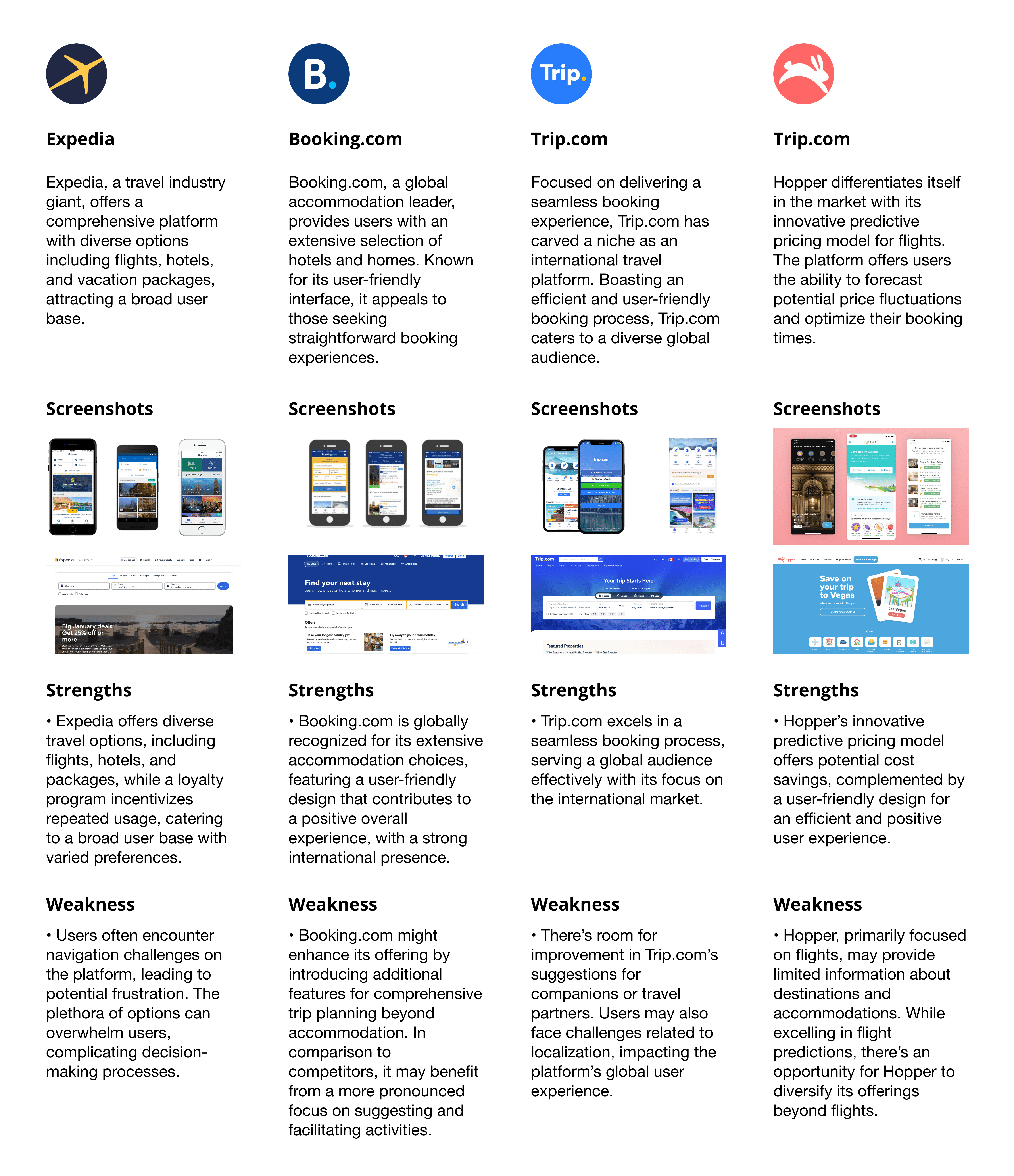
I kicked off the design process for Ace Travels by performing a detailed competitive analysis, concentrating on prime participants in the travel app market—Expedia, Booking.com, Trip.com, and Hopper. This analysis guided the initial stages of the design process, providing valuable insights into user preferences and market trends, steering the design of an innovative and user-friendly travel application, Ace Travels.
Summary
Incorporating a robust loyalty program into Ace Travels is a strategic move aimed at elevating user engagement and fostering retention. The program is designed to incentivize users, encouraging them to consistently choose Ace Travels for their travel requirements. Users can enjoy exclusive benefits such as discounts, perks, or points for every booking and various interactions within the app.
By implementing this feature, Ace Travels not only seeks to cultivate user loyalty but also enhances the overall user experience. This approach aligns seamlessly with industry standards, acknowledging the expectations of modern travellers who value and appreciate the rewards and benefits offered for their continuous usage of the platform. The loyalty program serves as a key differentiator, adding value and reinforcing Ace Travels as a preferred and rewarding travel companion in the competitive landscape.
User Interviews
As part of the iterative design process for Ace Travels, user interviews are conducted to gain valuable insights into the preferences, expectations, and pain points of potential users. The goal is to ensure that Ace Travels not only addresses existing gaps in the travel app landscape but also resonates with users on a personal level, providing a seamless and enjoyable travel planning experience.
Objective
Gather insights from a diverse group of participants, both remotely and in-person, aged 18 and above, to understand their travel preferences, pain points, and expectations for Ace Travels.
Design Structure
The interview systematically explores participants' travel preferences and experiences with Ace Travels. It starts with a warm introduction, fostering comfort. An icebreaker encourages sharing recent travel experiences, establishing rapport. Subsequent segments cover general travel habits, Ace Travels' user experience, and scenario-based questions. The loyalty program discussion gauges interest in potential features. The closing expresses gratitude for input, encouraging ongoing feedback for continuous improvement.
Key Considerations
Remote Interviews: Use video conferencing tools for remote interviews, ensuring clear communication and screen sharing capabilities.
User Diversity: Ensure a diverse group representing various travel preferences, ages, and backgrounds.
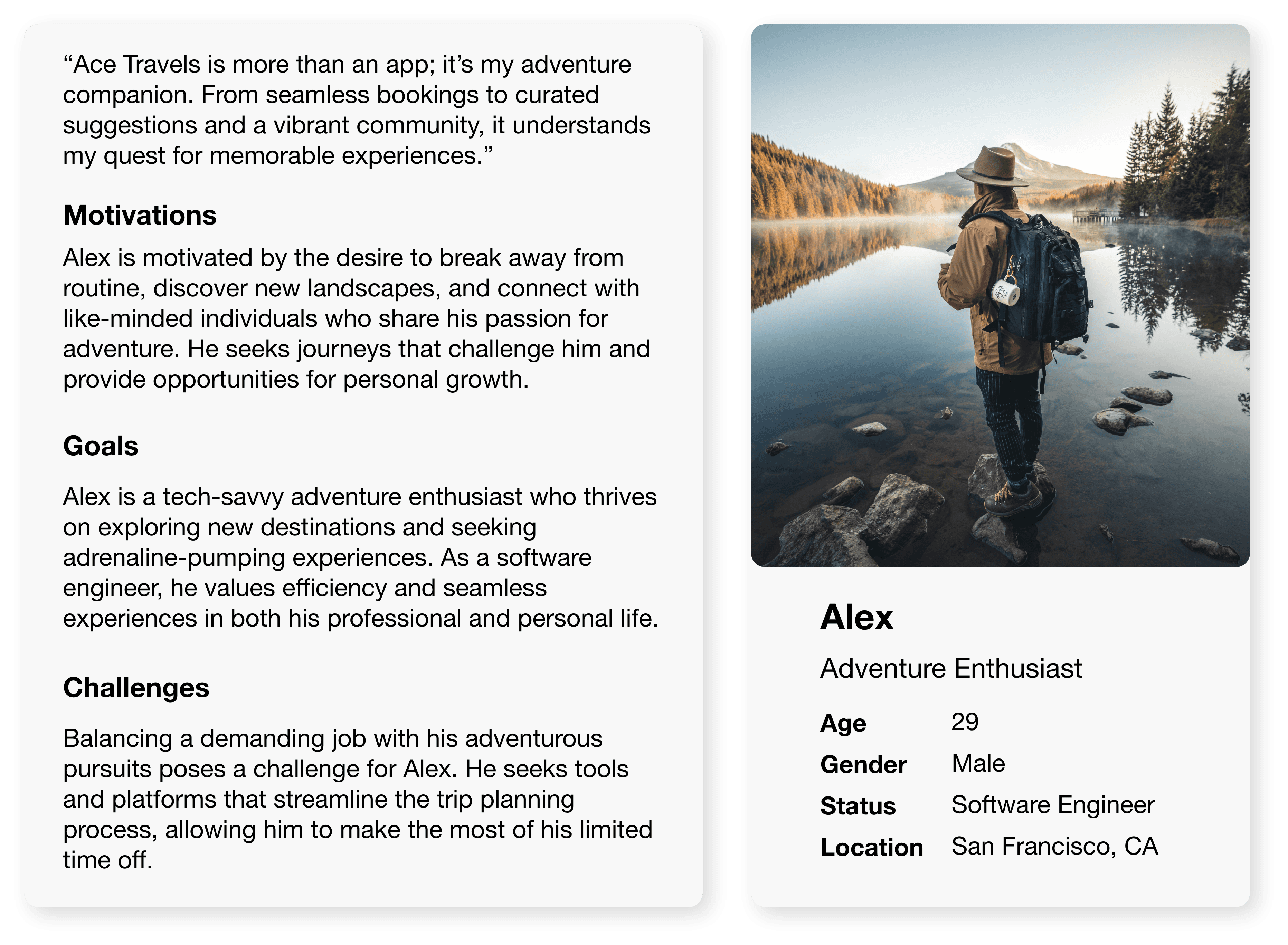
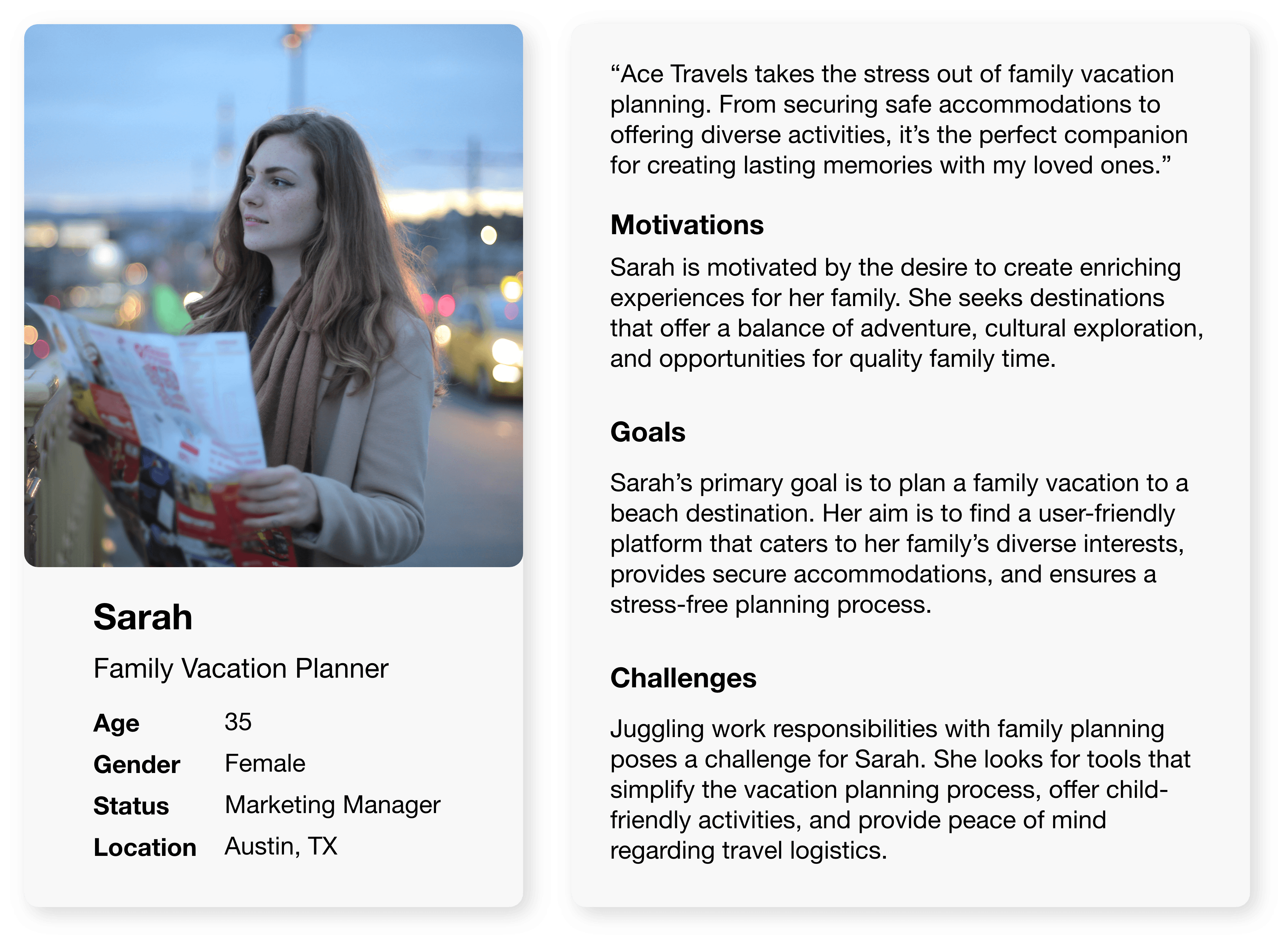
Target Audience Alignment: Align questions with Ace Travels' target audience, focusing on features that resonate with frequent business travelers, adventure enthusiasts, budget-conscious vacationers, family vacation planners, and spontaneous travelers.
User Comfort: Emphasize a user-centric approach, making participants feel valued and comfortable sharing their experiences.
Personas
User Journey Map - Alex
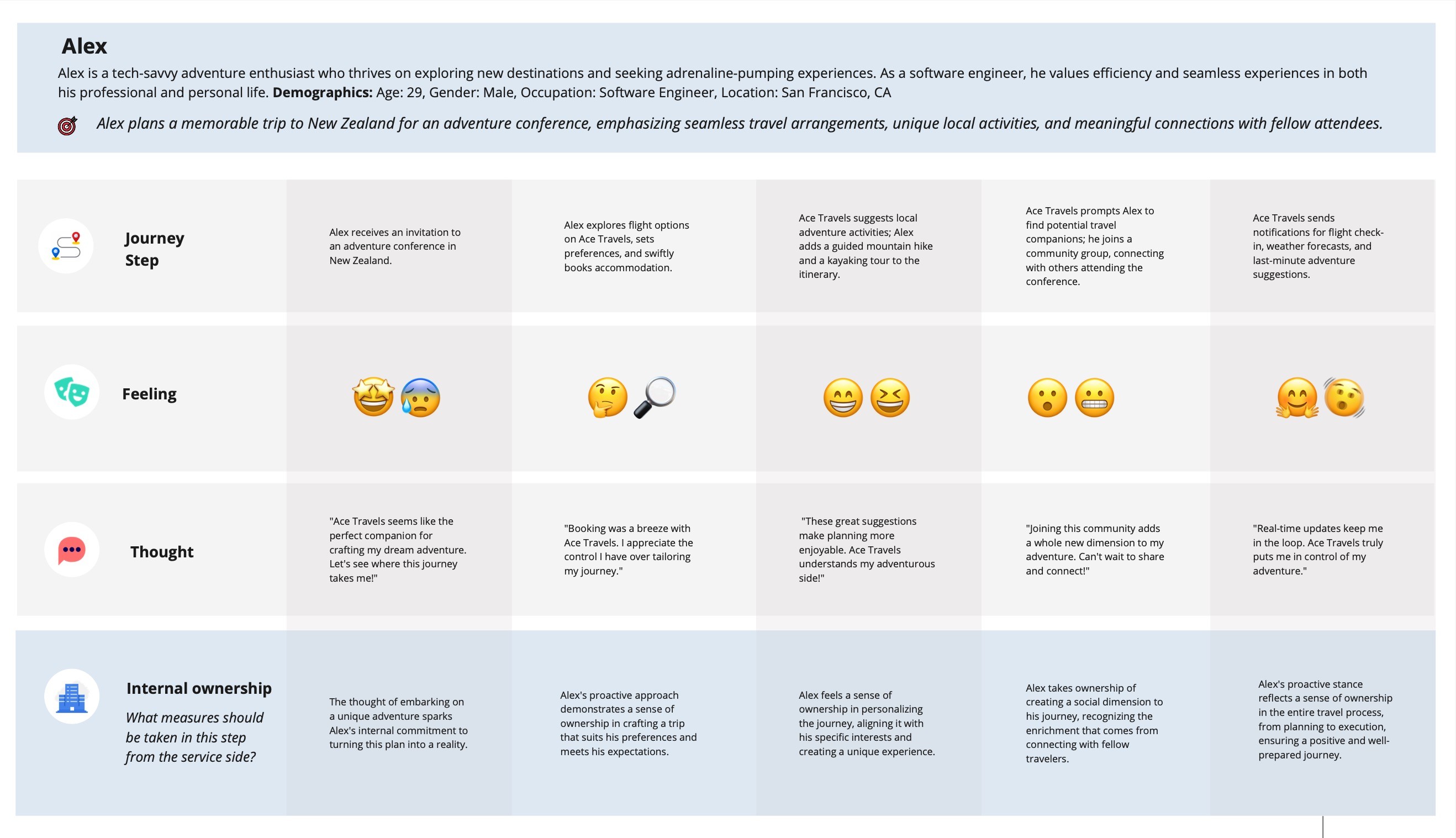
I created Alex's user journey map for Ace Travels by identifying his goals, defining his journey step, mapping emotions, and incorporating internal ownership, and analyzing insights to enhance the overall user experience.
Wireframes
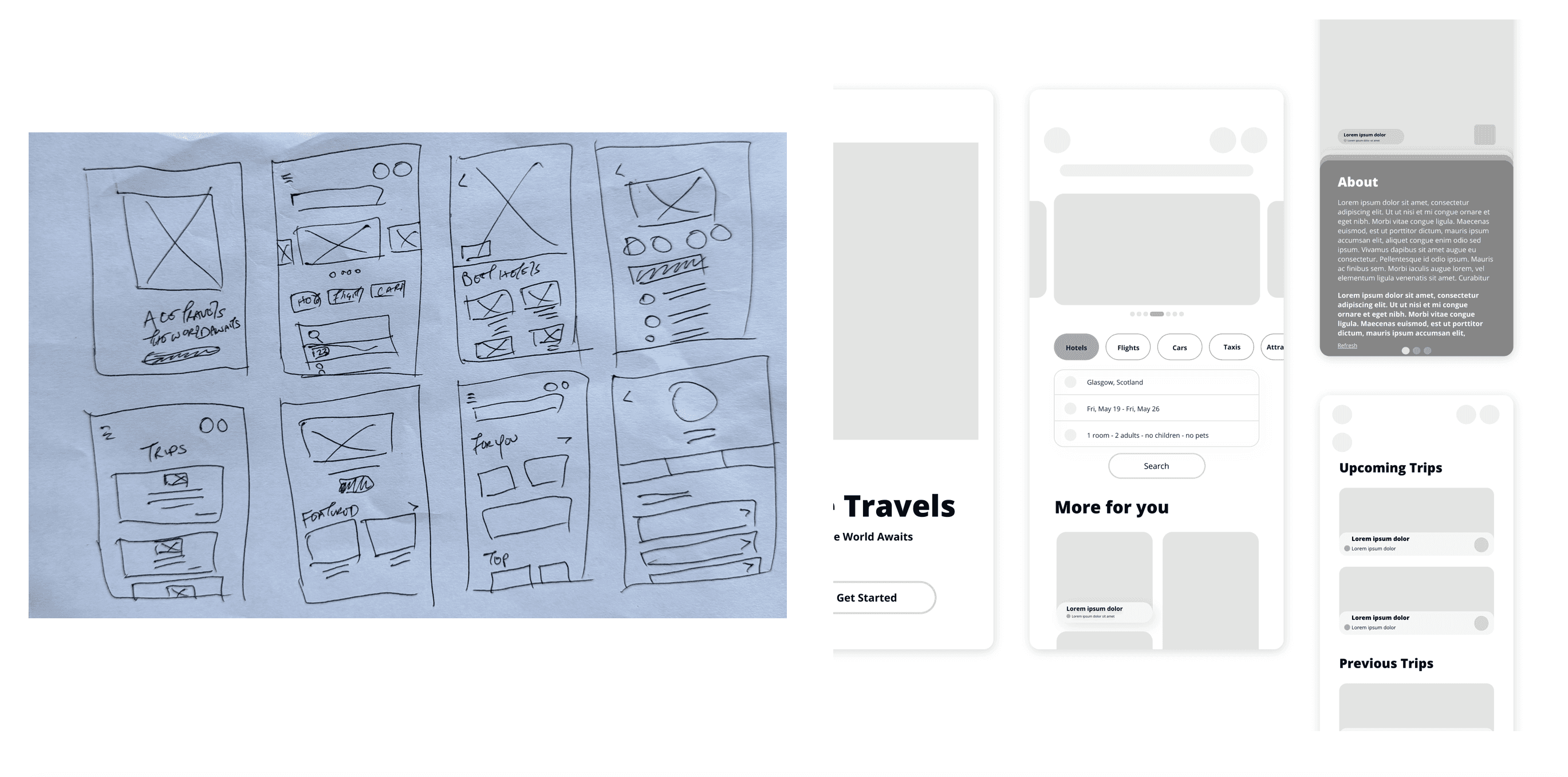
The wireframes prioritize visual consistency, mobile responsiveness, and seamless user flows to ensure a cohesive and enjoyable experience. The goal is to establish a foundation that aligns with Ace Travels' brand aesthetics and facilitates collaborative decision-making in the design process.
UI Designs
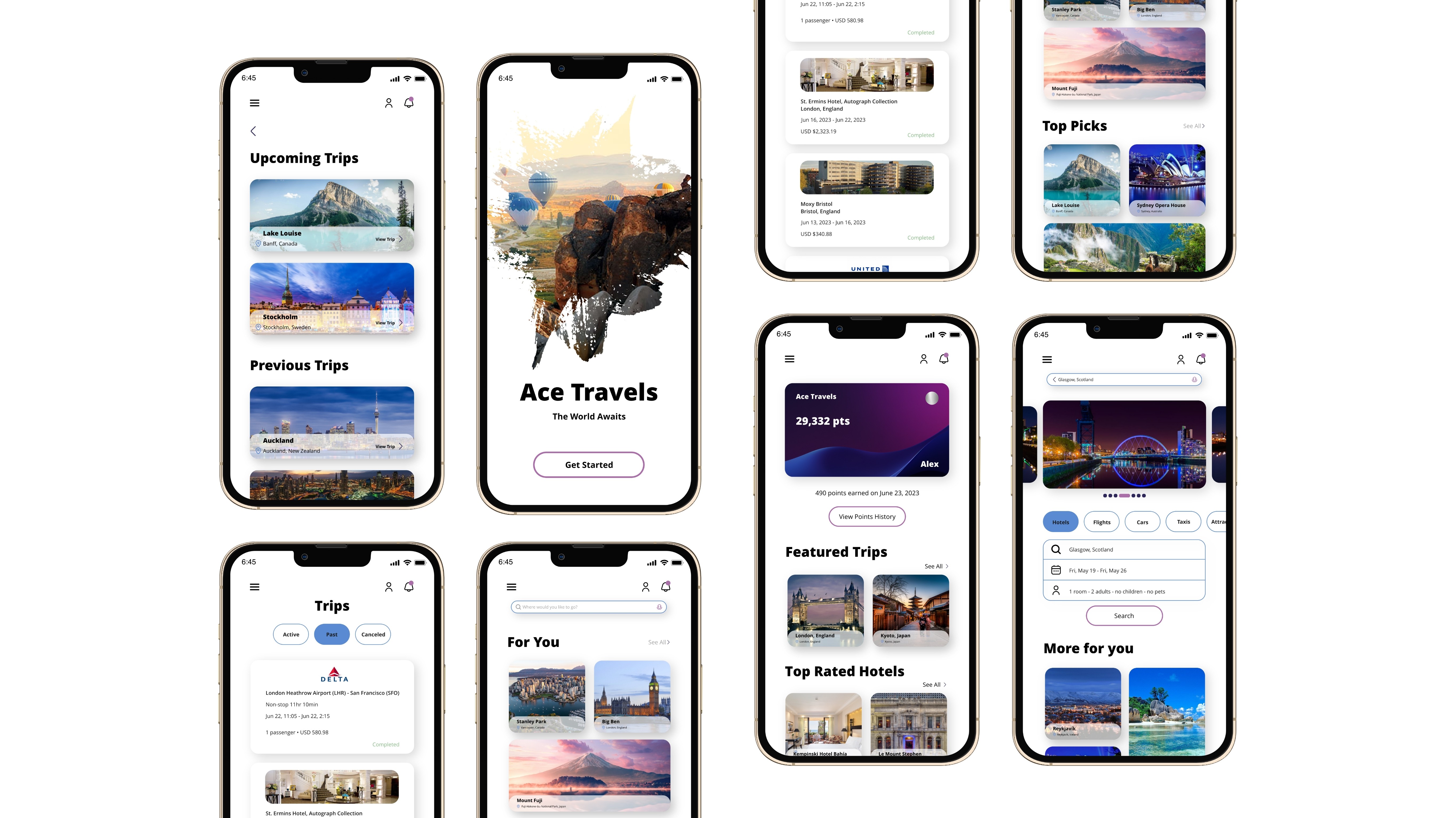
Leveraging insights from Ace Travels' brand identity, user personas, and wireframes, the UI designs embody a modern, friendly aesthetic with a carefully curated colour palette and typography. The interface prioritizes intuitive navigation, clear icons, and mobile responsiveness, ensuring a seamless and visually appealing experience for users across diverse devices.
Takeaways
The Ace Travels case study highlights my commitment to good user experience design, strategic positioning against competitors, meticulous information architecture, and a relentless dedication to continuous improvement. By understanding my users' distinct needs and incorporating insights from a competitive landscape, Ace Travels aims to deliver a comprehensive travel application that caters to diverse preferences.
This approach, complemented by my thoughtful information architecture and an iterative design process, serves as a guiding principle for creating a dynamic travel platform that evolves with the ever-changing demands of modern travellers.
Ace Travels
UX/UI Research & Design

About
Roles: UX/UI Designer
Duration: May 2023 - July 2023
Tools: Figma, Adobe Illustrator, Miro
Ace Travels is a user friendly travel application which allows users to schedule their trips conveniently and efficiently, by providing useful information on and suggesting itineraries for destinations all over the world. From your destination details, to transportation and accommodation, Ace Travels will find everything for you.
Project Details
Ace Travels is an ambitious project aimed at revolutionizing the way individuals plan and experience their journeys. As a comprehensive travel application, Ace Travels seeks to address the diverse needs of modern travelers by offering a user-friendly platform that facilitates seamless trip planning, organization, and execution. The project's primary focus is on providing a holistic suite of tools and information to make travel planning both enjoyable and memorable.
UX Research
Competitive Analysis
I kicked off the design process for Ace Travels by performing a detailed competitive analysis, concentrating on prime participants in the travel app market—Expedia, Booking.com, Trip.com, and Hopper. This analysis guided the initial stages of the design process, providing valuable insights into user preferences and market trends, steering the design of an innovative and user-friendly travel application, Ace Travels.

Summary
Incorporating a robust loyalty program into Ace Travels is a strategic move aimed at elevating user engagement and fostering retention. The program is designed to incentivize users, encouraging them to consistently choose Ace Travels for their travel requirements. Users can enjoy exclusive benefits such as discounts, perks, or points for every booking and various interactions within the app.
By implementing this feature, Ace Travels not only seeks to cultivate user loyalty but also enhances the overall user experience. This approach aligns seamlessly with industry standards, acknowledging the expectations of modern travellers who value and appreciate the rewards and benefits offered for their continuous usage of the platform. The loyalty program serves as a key differentiator, adding value and reinforcing Ace Travels as a preferred and rewarding travel companion in the competitive landscape.
User Interviews
As part of the iterative design process for Ace Travels, user interviews are conducted to gain valuable insights into the preferences, expectations, and pain points of potential users. The goal is to ensure that Ace Travels not only addresses existing gaps in the travel app landscape but also resonates with users on a personal level, providing a seamless and enjoyable travel planning experience.
Objective
Gather insights from a diverse group of participants, both remotely and in-person, aged 18 and above, to understand their travel preferences, pain points, and expectations for Ace Travels.
Design Structure
The interview systematically explores participants' travel preferences and experiences with Ace Travels. It starts with a warm introduction, fostering comfort. An icebreaker encourages sharing recent travel experiences, establishing rapport. Subsequent segments cover general travel habits, Ace Travels' user experience, and scenario-based questions. The loyalty program discussion gauges interest in potential features. The closing expresses gratitude for input, encouraging ongoing feedback for continuous improvement.
Key Considerations
Remote Interviews: Use video conferencing tools for remote interviews, ensuring clear communication and screen sharing capabilities.
User Diversity: Ensure a diverse group representing various travel preferences, ages, and backgrounds.
Target Audience Alignment: Align questions with Ace Travels' target audience, focusing on features that resonate with frequent business travelers, adventure enthusiasts, budget-conscious vacationers, family vacation planners, and spontaneous travelers.
User Comfort: Emphasize a user-centric approach, making participants feel valued and comfortable sharing their experiences.
Personas


User Journey Map - Alex
I created Alex's user journey map for Ace Travels by identifying his goals, defining his journey step, mapping emotions, and incorporating internal ownership, and analyzing insights to enhance the overall user experience.

Wireframes
The wireframes prioritize visual consistency, mobile responsiveness, and seamless user flows to ensure a cohesive and enjoyable experience. The goal is to establish a foundation that aligns with Ace Travels' brand aesthetics and facilitates collaborative decision-making in the design process.

UI Designs
Leveraging insights from Ace Travels' brand identity, user personas, and wireframes, the UI designs embody a modern, friendly aesthetic with a carefully curated colour palette and typography. The interface prioritizes intuitive navigation, clear icons, and mobile responsiveness, ensuring a seamless and visually appealing experience for users across diverse devices.

Takeaways
The Ace Travels case study highlights my commitment to good user experience design, strategic positioning against competitors, meticulous information architecture, and a relentless dedication to continuous improvement. By understanding my users' distinct needs and incorporating insights from a competitive landscape, Ace Travels aims to deliver a comprehensive travel application that caters to diverse preferences.
This approach, complemented by my thoughtful information architecture and an iterative design process, serves as a guiding principle for creating a dynamic travel platform that evolves with the ever-changing demands of modern travellers.
Ace Travels
UX/UI Research & Design

About
Roles: UX/UI Designer
Duration: May 2023 - July 2023
Tools: Figma, Adobe Illustrator, Miro
Ace Travels is a user friendly travel application which allows users to schedule their trips conveniently and efficiently, by providing useful information on and suggesting itineraries for destinations all over the world. From your destination details, to transportation and accommodation, Ace Travels will find everything for you.
Project Details
Ace Travels is an ambitious project aimed at revolutionizing the way individuals plan and experience their journeys. As a comprehensive travel application, Ace Travels seeks to address the diverse needs of modern travelers by offering a user-friendly platform that facilitates seamless trip planning, organization, and execution. The project's primary focus is on providing a holistic suite of tools and information to make travel planning both enjoyable and memorable.
UX Research
Competitive Analysis
I kicked off the design process for Ace Travels by performing a detailed competitive analysis, concentrating on prime participants in the travel app market—Expedia, Booking.com, Trip.com, and Hopper. This analysis guided the initial stages of the design process, providing valuable insights into user preferences and market trends, steering the design of an innovative and user-friendly travel application, Ace Travels.

Summary
Incorporating a robust loyalty program into Ace Travels is a strategic move aimed at elevating user engagement and fostering retention. The program is designed to incentivize users, encouraging them to consistently choose Ace Travels for their travel requirements. Users can enjoy exclusive benefits such as discounts, perks, or points for every booking and various interactions within the app.
By implementing this feature, Ace Travels not only seeks to cultivate user loyalty but also enhances the overall user experience. This approach aligns seamlessly with industry standards, acknowledging the expectations of modern travellers who value and appreciate the rewards and benefits offered for their continuous usage of the platform. The loyalty program serves as a key differentiator, adding value and reinforcing Ace Travels as a preferred and rewarding travel companion in the competitive landscape.
User Interviews
As part of the iterative design process for Ace Travels, user interviews are conducted to gain valuable insights into the preferences, expectations, and pain points of potential users. The goal is to ensure that Ace Travels not only addresses existing gaps in the travel app landscape but also resonates with users on a personal level, providing a seamless and enjoyable travel planning experience.
Objective
Gather insights from a diverse group of participants, both remotely and in-person, aged 18 and above, to understand their travel preferences, pain points, and expectations for Ace Travels.
Design Structure
The interview systematically explores participants' travel preferences and experiences with Ace Travels. It starts with a warm introduction, fostering comfort. An icebreaker encourages sharing recent travel experiences, establishing rapport. Subsequent segments cover general travel habits, Ace Travels' user experience, and scenario-based questions. The loyalty program discussion gauges interest in potential features. The closing expresses gratitude for input, encouraging ongoing feedback for continuous improvement.
Key Considerations
Remote Interviews: Use video conferencing tools for remote interviews, ensuring clear communication and screen sharing capabilities.
User Diversity: Ensure a diverse group representing various travel preferences, ages, and backgrounds.
Target Audience Alignment: Align questions with Ace Travels' target audience, focusing on features that resonate with frequent business travelers, adventure enthusiasts, budget-conscious vacationers, family vacation planners, and spontaneous travelers.
User Comfort: Emphasize a user-centric approach, making participants feel valued and comfortable sharing their experiences.
Personas


User Journey Map - Alex
I created Alex's user journey map for Ace Travels by identifying his goals, defining his journey step, mapping emotions, and incorporating internal ownership, and analyzing insights to enhance the overall user experience.

Wireframes
The wireframes prioritize visual consistency, mobile responsiveness, and seamless user flows to ensure a cohesive and enjoyable experience. The goal is to establish a foundation that aligns with Ace Travels' brand aesthetics and facilitates collaborative decision-making in the design process.

UI Designs
Leveraging insights from Ace Travels' brand identity, user personas, and wireframes, the UI designs embody a modern, friendly aesthetic with a carefully curated colour palette and typography. The interface prioritizes intuitive navigation, clear icons, and mobile responsiveness, ensuring a seamless and visually appealing experience for users across diverse devices.

Takeaways
The Ace Travels case study highlights my commitment to good user experience design, strategic positioning against competitors, meticulous information architecture, and a relentless dedication to continuous improvement. By understanding my users' distinct needs and incorporating insights from a competitive landscape, Ace Travels aims to deliver a comprehensive travel application that caters to diverse preferences.
This approach, complemented by my thoughtful information architecture and an iterative design process, serves as a guiding principle for creating a dynamic travel platform that evolves with the ever-changing demands of modern travellers.
Ace Travels
UX/UI Research & Design

About
Roles: UX/UI Designer
Duration: May 2023 - July 2023
Tools: Figma, Adobe Illustrator, Miro
Ace Travels is a user friendly travel application which allows users to schedule their trips conveniently and efficiently, by providing useful information on and suggesting itineraries for destinations all over the world. From your destination details, to transportation and accommodation, Ace Travels will find everything for you.
Project Details
Ace Travels is an ambitious project aimed at revolutionizing the way individuals plan and experience their journeys. As a comprehensive travel application, Ace Travels seeks to address the diverse needs of modern travelers by offering a user-friendly platform that facilitates seamless trip planning, organization, and execution. The project's primary focus is on providing a holistic suite of tools and information to make travel planning both enjoyable and memorable.
UX Research
Competitive Analysis
I kicked off the design process for Ace Travels by performing a detailed competitive analysis, concentrating on prime participants in the travel app market—Expedia, Booking.com, Trip.com, and Hopper. This analysis guided the initial stages of the design process, providing valuable insights into user preferences and market trends, steering the design of an innovative and user-friendly travel application, Ace Travels.

Summary
Incorporating a robust loyalty program into Ace Travels is a strategic move aimed at elevating user engagement and fostering retention. The program is designed to incentivize users, encouraging them to consistently choose Ace Travels for their travel requirements. Users can enjoy exclusive benefits such as discounts, perks, or points for every booking and various interactions within the app.
By implementing this feature, Ace Travels not only seeks to cultivate user loyalty but also enhances the overall user experience. This approach aligns seamlessly with industry standards, acknowledging the expectations of modern travellers who value and appreciate the rewards and benefits offered for their continuous usage of the platform. The loyalty program serves as a key differentiator, adding value and reinforcing Ace Travels as a preferred and rewarding travel companion in the competitive landscape.
User Interviews
As part of the iterative design process for Ace Travels, user interviews are conducted to gain valuable insights into the preferences, expectations, and pain points of potential users. The goal is to ensure that Ace Travels not only addresses existing gaps in the travel app landscape but also resonates with users on a personal level, providing a seamless and enjoyable travel planning experience.
Objective
Gather insights from a diverse group of participants, both remotely and in-person, aged 18 and above, to understand their travel preferences, pain points, and expectations for Ace Travels.
Design Structure
The interview systematically explores participants' travel preferences and experiences with Ace Travels. It starts with a warm introduction, fostering comfort. An icebreaker encourages sharing recent travel experiences, establishing rapport. Subsequent segments cover general travel habits, Ace Travels' user experience, and scenario-based questions. The loyalty program discussion gauges interest in potential features. The closing expresses gratitude for input, encouraging ongoing feedback for continuous improvement.
Key Considerations
Remote Interviews: Use video conferencing tools for remote interviews, ensuring clear communication and screen sharing capabilities.
User Diversity: Ensure a diverse group representing various travel preferences, ages, and backgrounds.
Target Audience Alignment: Align questions with Ace Travels' target audience, focusing on features that resonate with frequent business travelers, adventure enthusiasts, budget-conscious vacationers, family vacation planners, and spontaneous travelers.
User Comfort: Emphasize a user-centric approach, making participants feel valued and comfortable sharing their experiences.
Personas


User Journey Map - Alex
I created Alex's user journey map for Ace Travels by identifying his goals, defining his journey step, mapping emotions, and incorporating internal ownership, and analyzing insights to enhance the overall user experience.

Wireframes
The wireframes prioritize visual consistency, mobile responsiveness, and seamless user flows to ensure a cohesive and enjoyable experience. The goal is to establish a foundation that aligns with Ace Travels' brand aesthetics and facilitates collaborative decision-making in the design process.

UI Designs
Leveraging insights from Ace Travels' brand identity, user personas, and wireframes, the UI designs embody a modern, friendly aesthetic with a carefully curated colour palette and typography. The interface prioritizes intuitive navigation, clear icons, and mobile responsiveness, ensuring a seamless and visually appealing experience for users across diverse devices.

Takeaways
The Ace Travels case study highlights my commitment to good user experience design, strategic positioning against competitors, meticulous information architecture, and a relentless dedication to continuous improvement. By understanding my users' distinct needs and incorporating insights from a competitive landscape, Ace Travels aims to deliver a comprehensive travel application that caters to diverse preferences.
This approach, complemented by my thoughtful information architecture and an iterative design process, serves as a guiding principle for creating a dynamic travel platform that evolves with the ever-changing demands of modern travellers.

